Monday, February 01, 2010
Saturday, December 12, 2009
Improve the iPhone usabillity
1. Phonebook: Favorites
Ther iPhone relies heavily on icons, though the "Favorites" tab under "Contacts" does not. It is a normal text list:
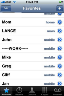
Using the Contacts photos would be much easier and allows for my contacts without scrolling. The application "My Phone Plus For Facebook" has done this already, displaying 9 contacts as opposed to the current 8:
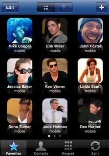
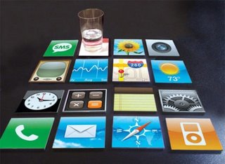
However making the icons the same size as the rest of the iPhone's icons would give a total of 16 favorites (considering I have several hundred contacts, 16 is not that many..:)
 2. Many applications installed gives loads of scrolling
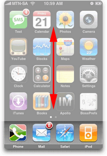
If you are like me, then you have many apps installed. This means right scrolling and scrolling the screen to the right. Vertical scrolling has though not been used:
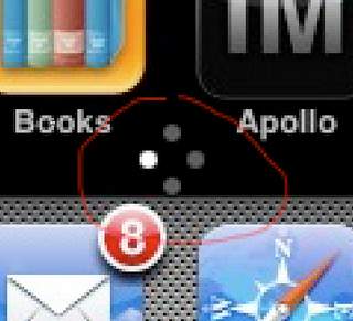
Small circles could indicate where one is:
3. Most of my contacts have birthdays noted in the phonebook.
Why isn't this info linked up to the calendar? Or at least one ought to have the option to get notifications of birthdays. (I use fbCal to have birthdays in another calendar on the iPhone, but I tend to forget to look at it. Hence the desire for birthday intergration.
4. Improve battery life A product can be as fantastic as it wants, but when such a basic feature isn't in place, then quite alot falls apart. I mean, if I make it through the day with one charing I am happy. Heavy usage makes it last maybe 7-8 hours. Sorry, MAC. Please improve.
Monday, August 31, 2009
Great typography sites
Personal favourites include:
Great websitedesign, great icons. All based on Helvetica Yummy.
Typesites.com
Proper reviews of website typography. Good stuff.
Wednesday, July 22, 2009
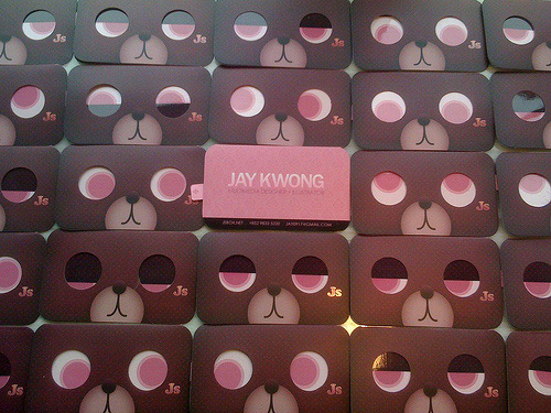
More business card inspiration
Labels: design
Monday, July 20, 2009
Logo trends 2009
But its still an interresting read.
Monday, June 15, 2009
Friday, June 12, 2009
Cheap laptop stands made of cardboard

But why pay, when you can create it yourself!? Laptop cardboard tutorial

Or even from a clothhanger.
Monday, May 25, 2009
Find inspiration from other websites
Thursday, May 21, 2009
Kikora logo changed (for the worse)

Two years later they got it redesigned by Miksmaster. They have done wonders with the website and the application as Kikora didnt use any designer on it before. BUT, and I know I am biased here, how did this redesign make the logo better?!
2.

Saturday, May 16, 2009
Monday, May 11, 2009
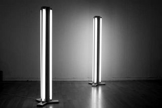
Designer lamps that rock (a give light!)
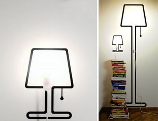 The Sticker Lamp (Tall & Tiny) by created by Italian designer Alicero Signoli.
Buy them at PA Design
The Liquid Lamp
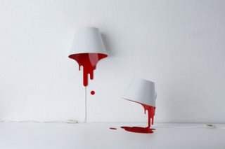 by Caina’s Design Shop. A bit pricey at US $262, but really cool
Neon Lamp
(created by yourself) thanks to design by OpenDesignClub and Instructables.com
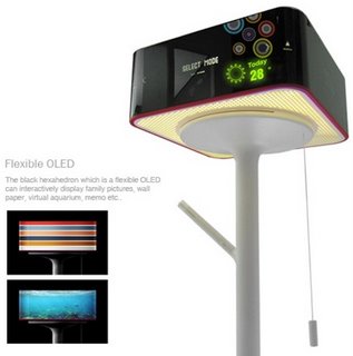
Or the slightly more futuristic (non existing) "PC lamp" by designer Seungchan Lee
Tuesday, May 05, 2009
Tuesday, April 21, 2009
Monday, April 20, 2009
Fonts, fonts, Type.
Sunday, April 19, 2009
Friday, April 17, 2009
I am a nerd: more cool Lego robots
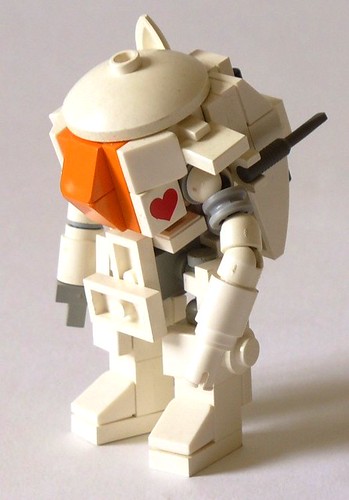 Just found this fantastic Lego robot on Flickr:
SAFS Heart
by someone called Gambort. He/She has a album called Mecca filled with cool Lego robots. I love the Internet!
Tuesday, March 10, 2009
Logo design tips by Designer Daily
Ah, and then there are a bunch of commentaries suggesting even more tips.
Sunday, March 08, 2009
Monday, January 26, 2009
Good looking icons
Wednesday, December 31, 2008
Thursday, December 25, 2008
Create your own desginer belt: Apple Mac Pro Mouse Beltbuckle
 Finally a thing to do with your all electronic trash.. Instructables has a great site with loads of tutorials and tips how to create fun stuff, just like this really nerdy beltbuckle: http://www.instructables.com/id/Pro-Mouse-Beltbuckle/
Wednesday, December 24, 2008
Stylish looking suitcase and other sexy industrial designs
Monday, December 22, 2008
Nabaztag the cute rabbit
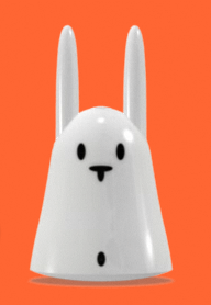 Funky looking digital rabbit the Nabaztag
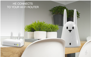 that is connected to the Internet. Reads your email, rss feeds, oh... I dont get it really. BUT I want one now! Bit steep price though 145Euro...
http://www.nabaztag.com
Monday, December 15, 2008
Create peeling sticker effect in Photoshop - tutorial
 Sometimes you want to create fake stickers on your Photoshop artwork. And here is a great tutorial how to do that:
http://9tutorials.com/2007/07/23/peeling-sticker-effect.html
Thursday, December 11, 2008
Transformers: Robots made of paper!
http://www.paperrobots1999.com
Friday, November 14, 2008
Monday, November 10, 2008
Amazing wallpapers
 http://dlanham.com/art/lasthouse/
Labels: design
Monday, October 27, 2008
Best and worst of Olympic design
Personally I prefer the Mexico from 1988. Pretty funky
And when it comes to the logo for London 2012, I find it looks like the Jewish museum Berlin which was designed by Liebeskind. Great museum and building. But as a logo...!?
Piet Mondrian does shoes
http://zozo.jp/shop
Labels: design
Wednesday, October 22, 2008
Loads of free comic fonts! Even Roy Lichtenstein style
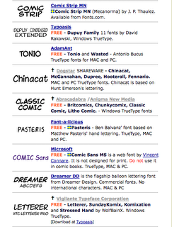 You want to use Roy Lichtensteins comic font that he used in his speech bubbles? One was created by Albright-Knox Art Gallery: "P22 Pop Art Comic"
According to Fontshop
"The Pop Art font set was developed for the Albright-Knox Art Gallery in Buffalo, New York. The Comic typeface, in regular and bold italic, was inspired by the work of Roy Lichtenstein, whose crisp, clear caps were distinctive but legible."
You can buy it for example here:
Fonts.com
Dont want to pay? Here are loads of free alternatives:
hans.presto
Blambot
manfred-klein
"Laffayette Comic Pro" is fairly similar:
dafont
Tuesday, October 14, 2008
Tuesday, October 07, 2008
Monday, October 06, 2008
Loads of great looking RSS feed icon for free
Monday, September 29, 2008
Read magazines online for free
"Read the world. Publish the world." Thats what http://issuu.com/ claims anyways. See for yourself what you think!
Friday, September 26, 2008
How to create a Roy Lichtenstein style image in Photoshop or Illustrator
 Here are some great tutorials if you would like to become a pop-art artist!
http://vectortuts.com/illustration/turning-a-photo-into-lichtenstein-style-pop-art-with-illustrator/
http://www.creativepro.com/article/digital-pop-art-unleash-your-inner-warhol
http://www.melissaclifton.com/tutorial-popart.html
http://www.pcadvisor.co.uk/news/index.cfm?newsid=11762
Sunday, September 14, 2008
Pantone magnetic calendar designed by Stokke Austad
 Heres a great protoype for a Pantone magnetic calendar, designed by Stokke Austad. It will be displayed at Home Acessories at 100% Norway 2008 in Earls Court, London.
Heres a selection of other great designs from Norway that will be at 100% Norway
Thursday, September 11, 2008
Global logo trends according to logolounge.com
 LogoLounge.com have categorised 27 000 logos and found a couple of trends: supernova, fine lines, FoldOver, etc, etc.!
A great overview and inspiration.
Thursday, August 28, 2008
Robots made of fonts are Fontbots!
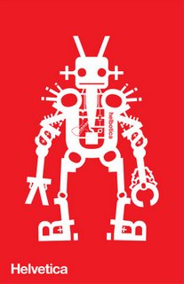 As a design nerd, you gotta love these fontbots made by Jonathon Yule:
http://www.invdr.com/invdr_portfolio_fontbots.html
Its a bird, its a plane, no it is Helbotica!
Labels: design
Wednesday, July 30, 2008
Western (animated) Spaghetti by PES
Tuesday, June 03, 2008
Amazing (design) reports
Labels: design
Friday, May 30, 2008
Wednesday, May 21, 2008
5 sites that sell you on the web
http://capdesign.idg.se/2.990/1.161853
Labels: advertising, design, web
Monday, May 19, 2008
D&AD Awards 2008 winner
http://www.dandad.org/awards08/index.asp
and these are the categories:
Ambient
Art Direction
Book Design
Branding
Broadcast Innovations
Digital Installations
Direct
Environmental Design
Gaming
Graphic Design
Juries I-P
Illustration
Integrated
Magazine & Newspaper Design
Mobile Marketing
Music Videos
Online Advertising
Packaging Design
Photography
Poster Advertising
Press Advertising
Juries P-W
Product Design
Radio
TV & Cinema Advertising
TV & Cinema Crafts
TV & Cinema Graphics
Typography
Viral
Websites
Writing for Advertising
Writing for Design
I particullary like the Yellow pencil winner for Writing for Advertising (TV & Cinema Advertising)
Title: Michael Madsen
Agency: Mother
Client: Orange
Labels: advertising, design, web
Thursday, May 15, 2008
Paint websites gold!
Tuesday, May 13, 2008
Webby awards 2008
| The winners of the Webby Awards 2008 have been chosen. And here are my favourites: BEST NAVIGATION/STRUCTURE Nominees Blenderbox 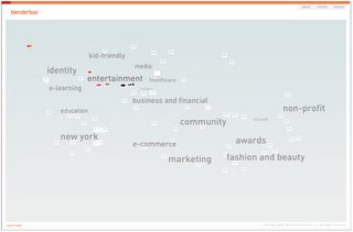 Schematic |
| BEST USE OF ANIMATION OR MOTION GRAPHICS People's Voice Winner: Zune Journey Agency: T.A.G. SF / Firstborn  |
| BEST VISUAL DESIGN - AESTHETIC Checkland Kindleysides Agency/Credited Organization: Sennep |
Thursday, May 08, 2008
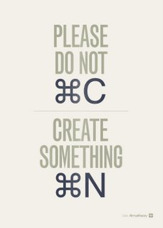
atmostheory - Please do not copy
Wednesday, April 30, 2008
Cool t-shirts from Phatrags
http://www.phatrags.com/
Use this code if you want to save 10%: phat10a
Cool designer font screensavers
A great Helvetica screensaver from: http://scr.sc/products/dropclock/ And its both for Windows and osX! HOWEVER: 136mb for a screensaver is rather heavy.. (And I cant seem to get it downloaded somehow...) Any help?
This wordclock is also pretty cool:
Looking for more news on type? Check out this: http://www.typeneu.com/
Monday, April 28, 2008
Norwegian musicfestival posters
 NORGES KULESTE FESTIVALPLAKAT
Have a look at most of Norways musicfestival posters at VG. Personally Im quite fond of Arendals "Canal Street" poster designed by Innoventi
Brandjunkie survey
Brandchannel:
The Brandjunkie survey results: http://www.brandchannel.com/features_effect.asp?pf_id=415
A concentrated dose of the Brandjunkies results http://brandchannel.com/features_effect.asp?pf_id=416
Labels: advertising, design, new, product
Friday, April 18, 2008
Padre Paranoia sells funky t-shirts!
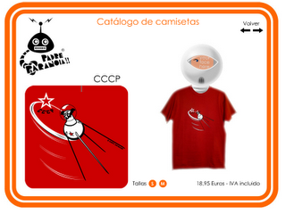 My Spanish friend Chema has gotten his new website up and running. See (and order!) his great designs at
http://www.padreparanoia.com/
Personally, I like the flying Leika the best :)
Tuesday, April 15, 2008
Next years color trends
Tuesday, April 08, 2008
Design your own font
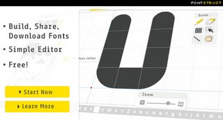 Easy web application to create your own font for free. They will be under Creative Commons license and hence free for all users
Test it here: http://fontstruct.fontshop.com/
Thursday, March 27, 2008
Loads of Typos at ilovetypography.com
Saturday, March 22, 2008
David Collins website
Monday, February 11, 2008
Buy your tshirt now, get free shipping!
 At a Minimum Order of £
35 or 50€ or 400 Norwegian Kroner. Free Shipping and a red String Thong for free! Code: Valentinus2008+
Visit my webshop now: http://www.portada.no/butikk/
Friday, February 08, 2008
Find images and photos
Monday, January 21, 2008
Internal joke for nerdy designers: Design Police
Download template for sticker production and let people know what you think about posters, ads, etc. that you see everywhere around you.
http://www.design-police.org/
Tuesday, January 15, 2008
Thursday, December 27, 2007
A whole new time! (Neolog´s design watch)
 The German company Neolog have made this really cool wristwatch, called NEOLOG A-24 II. Rather than showing the time with numbers or a dial, the digital watch shows time as line.
NEOLOG is based on dividing time into intelligible units: Hours, units of ten minutes, and units of one minutes which are arranged in vertical blocks.
It takes a bit getting used to (at least for the first hour of having the watch..:) BUT it is so sexy... Christmas tip of the year I say! (too late for most countries, but if the gifts are given on the Holy 3 Kings Day there is still a chance!)
Check out the site (and order it) http://www.neolog.cc/english/ Ahh... and the site has some widget downloads too :)
Wednesday, December 12, 2007
Microsofts iPod
However, I really find the Zune Art site excellent! Its really a creative ad campaign that uses animation and indie tunes to promote the Zune. It ought to generate a buzz online. Loads of freebies: wallpaper, videos, even faltpack toys!Check it out:
http://www.zune-arts.net/
Sunday, November 04, 2007
Potential Architecture in Norway
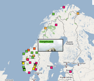 Theres a new website called Potential Architecture. It shows a wide selection of projects that of some reason nevere were realised. Quite interesting site I find.
Heres one project that unfortunately wasnt done: www.potentialarchitecture.com
The project in Røros, was done by Huus og Heim (who happens to be a friend of mine! :)
http://www.huusogheim.no/
Thursday, October 04, 2007
Lego screensaver and other fun things
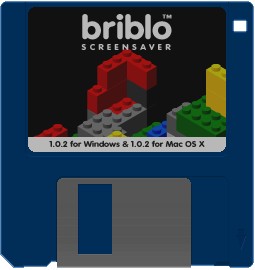 A site called 9031.com has loads of cool screensavers, wallpapers, etc. for free. Especially I love the "briblo" screensaver. Which is really loads of legos falling. AND if you have dualscreen (like I do), each screen shows a different lego setup. COOL!
http://www.9031.com/downloads/index.html
Tuesday, September 18, 2007
Free fonts and other free things...
 Quite dumb name for a site "Hacking Ballz", but they have quite nice free fonts (for testing purposes only of course!...)
Sunday, September 09, 2007
Happy website
 A friend of mine tipped me about this site. Its a US based webdesign company called The Happy Corp Global. Pretty cool site, with loads of info. http://www.thehappycorp.com/words/
Thursday, September 06, 2007
New Holmenkollen ski jump – Extending Tradition
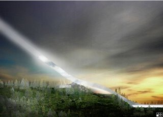 Congrats to the Danish architects of JDS / Julien de Smedt for winning the competition for the new Oslo Holmenkollen ski jump. Hope it will be built and ready to use in 2010. See all finalist here:
http://www.kultur-og-idrettsetaten.oslo.kommune.no
Labels: architecture, design, new
Tuesday, August 28, 2007
History of branding and companies
 Brands, brands, brands! Here's a great site that tells you the history of loads of brands.
and while this linkhas more articles, etc. on brands: historyofbranding 2
Labels: advertising, article, design, tip
Monday, July 16, 2007
Vector logos in EPS: Its Brands of the World!
 At some point you need a companies logo vectorized, because you have a presentation to do, your client hasnt supplied you with a logo, or if do do have, its a crappy jpg. BUT help is near! Loads of logos can be found on: http://www.brandsoftheworld.com/
Friday, July 13, 2007
902 days later and finally a new a.beining.com website
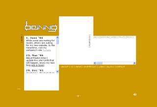 This is a screenshot of a.beining.com version 2. It lasted me 902 days. And around 2000 visits, of which 50% came from Norway, 13% Spain, 7% China (Beining is a city in China apparently), USA, UK ++
Most use XP (53%) and IE 6 (34%). BUT being a portfolio site, loads of Macers have come around too! 37% use osX and 34% Safari. Not bad.. :)
Well, after so long time without any updates (last one was the 1. of June 2006..), I was getting embaressed, SO without any further ado: TATAA! http://a.beining.com all new!
Labels: advertising, design, new, web
Wednesday, June 27, 2007
Cap&Design 20yrs present
 The brilliant Swedish design magazine Cap&Design is celebrating 20 years anniversary. And they are so nice, so they let us download 23 PDF backissues for free. Go to www.capdesign.se/jubilar20 Username: Läsare Password: jubileumsläsning
Happy birthday Cap (and to all readers: enjoy the PDFs.. :)!
Tuesday, May 22, 2007
Designer box wine cooler
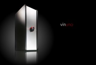 Heres a quite beautiful wine cooler for box wine. Its made out of metal and wood. And exist in black, white and red. They are sold for 1.000 NOK at Henie Onstad museum near Oslo. For more info: http://www.erdmanndesign.com/
Monday, May 14, 2007
Moderno vs Modena, logo similarities
 Over a year ago I designed the logo for the architect firm, Moderno. Handdrawn font in black, white and red.
 Then, the other day, I discovered a company called http://www.modena.no/ Really similar name to Moderno. BUT even the logo looks VERY similar to the one I designed.
Wednesday, May 09, 2007
The Robotic Chair
“The Robotic Chair”, collaborations with Canadian artists Max Dean and Matt Donovan. The Robotic Chair, their latest piece, is a work in progress. It was completed in mid-summer 2006, at which time it will make its first public appearance.
How cool was that?! I want one now!
Wednesday, April 18, 2007
Lov om beskyttelse av design
 You might want to find out about the laws of copyrights regarding your new and beautiful designed logo..?
Labels: advertising, article, design, tip
Sweet font: Popgod!
Friday, April 06, 2007
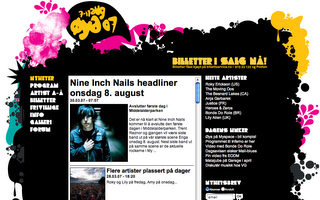
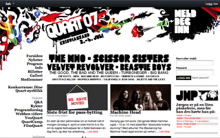
Style of the season: New Rave
Øya:
Quart:
 Hove (not really the same colorscheme, but quite similar freaky illustration style to Øya):
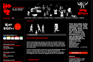
Oh, and if I have to choose festival: Hove has by far the best line-up. At least for my liking. Anyone want to join me!?
Thursday, March 29, 2007
Spiegel Designclicks & music
The German magazine Spiegel has some good design/photo collection. Check it out here:
http://designklicks.spiegel.de/index.php#dk=002
Also, if you need some suggestion for music: http://www.spiegel.de/kultur/musik/0,1518,473950,00.htmlWednesday, March 07, 2007
Create favicons for webbrowsers
http://www.html-kit.com/favicon/
The best is to create a square image from before, so you place your image correctly.
Monday, February 26, 2007
Oboy Oboy posters
Thursday, February 22, 2007
Grindhouse - Make your own trailer
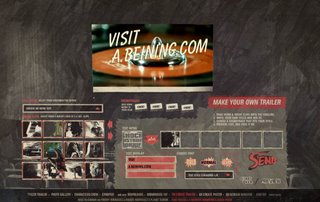 This Tarantino movie looks really cool! The art department have done a really good job with the trailer and especially the website. Have never seen a site with so much info and extras. Closest I come is "V for Vendetta", which also have great design.
The "Make your own trailer" of Grindhouse is excelent (seen on the left):
http://www.grindhousemovie.net/
Wednesday, February 14, 2007
Design blog
Tuesday, February 13, 2007
Change default font in InDesign
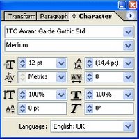 Like me, I suppose there are may out there that mainly work on one specific project at the time. And usually that means one default font too. Though Adobe, like Microsoft, love Times New Roman. So here's how to change the default font in InDesign:
You can make any active font the default font in the document by first making sure that's nothing's selected in your document (Command-Shift-A/Ctrl-Shift-A), then choosing the font you want from the Type > Font submenu or in the Character palette. All new text frames you create from then on in the document will use your new default font. If you change the default font without any documents open, that will be your new default font for all new InDesign documents you create.
This works for all other formatting defaults too!
More interesting InDesign tips from Informit
Wednesday, February 07, 2007
Tuesday, February 06, 2007
Posters Smokin Aces
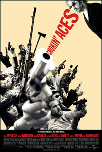
This is from Posterwires site:
"Smokin’ Aces director Joe Carnahan’s official site features a weblog written by the film’s creator about the upcoming film. For the past few months, Carnahan has been posting Smokin’ Aces poster designs that didn’t make the cut. It’s a rare opportunity to see all the unproduced movie posters that never make it to your local movie theatre lobby. As most film advertising art directors and designers will tell you, sometimes their best poster design work never sees the light of day beyond their own portfolios."
Labels: design
Russian proppaganda posters
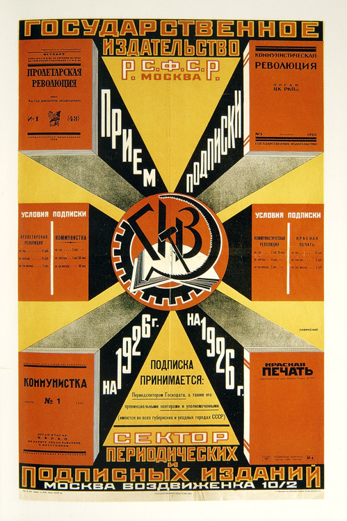
http://www.typogabor.com
Wednesday, January 17, 2007
Free shipping!
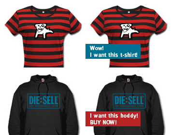 Some people might have noticed that I sell my own designed t-shirts here: http://www.portada.no/butikk
Well, as Valetine's Day is approaching I'm being nice and giving free shipping untill the 14.2.2007. The free shipping code is:
VALENTIN07
So nothing to keep you from shopping now!
Thursday, November 23, 2006
Friday, November 03, 2006
Create Letterhead Templates in MS Word

Follow www.CreativeTechs.com instructions. However, remember to place the image while in the header/footer view. "View -> Header/Footer"
(Only useful on a one-page document, or in a one-page section, or if it's the first page of a document or section.) If not placed in the Header, the image will not be locked and will easily move around when using the template.
Here are some HP letterhead suggestions
Friday, June 16, 2006
InDesign - rounded corners
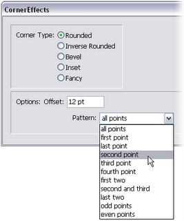
- Using a selection tool, select a path.
- Choose Object > Corner Options.
- Choose a corner effect in the Effect menu.
For Size, type a value to specify the radius by which the corner effect extends from each corner point.
- Select Preview if you want to see the results of the effect before applying it. Then click OK.

