Improve the iPhone usabillity
1. Phonebook: Favorites
Ther iPhone relies heavily on icons, though the "Favorites" tab under "Contacts" does not. It is a normal text list:

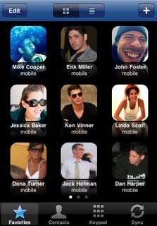
Using the Contacts photos would be much easier and allows for my contacts without scrolling. The application "My Phone Plus For Facebook" has done this already, displaying 9 contacts as opposed to the current 8:

However making the icons the same size as the rest of the iPhone's icons would give a total of 16 favorites (considering I have several hundred contacts, 16 is not that many..:)
 2. Many applications installed gives loads of scrolling
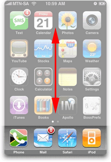
If you are like me, then you have many apps installed. This means right scrolling and scrolling the screen to the right. Vertical scrolling has though not been used:
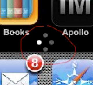
Small circles could indicate where one is:

3. Most of my contacts have birthdays noted in the phonebook.
Why isn't this info linked up to the calendar? Or at least one ought to have the option to get notifications of birthdays. (I use fbCal to have birthdays in another calendar on the iPhone, but I tend to forget to look at it. Hence the desire for birthday intergration.
4. Improve battery life A product can be as fantastic as it wants, but when such a basic feature isn't in place, then quite alot falls apart. I mean, if I make it through the day with one charing I am happy. Heavy usage makes it last maybe 7-8 hours. Sorry, MAC. Please improve.


0 Comments:
Post a Comment
Links to this post:
Create a Link
<< Home