Kikora logo changed (for the worse)
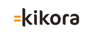
In 2007 I designed the logo (but not the website or application) for the Norwegian startup company Kikora. The company makes software for math teaching to pupils and students. The logo I created was using the idea that the solution for good math teaching is "equal to" Kikora, hence: =kikora. The colors chosen where supposed to show that they were a serious company. I also made a color scheme that had more vivid colors too, but it was turned down. (See the whole designmanual here.) This is my design: 1. 
Two years later they got it redesigned by Miksmaster. They have done wonders with the website and the application as Kikora didnt use any designer on it before. BUT, and I know I am biased here, how did this redesign make the logo better?!
2.

Two years later they got it redesigned by Miksmaster. They have done wonders with the website and the application as Kikora didnt use any designer on it before. BUT, and I know I am biased here, how did this redesign make the logo better?!
2.


0 Comments:
Post a Comment
Links to this post:
Create a Link
<< Home