Tuesday, October 14, 2008
Previous Posts
- Hurra! Rockettothesky's new album "Medea" is relea...
- New ways a promoting music: Piratebay!
- Compare different video sites
- Funny products for iPod / Mac geeks (like me..)
- Loads of great looking RSS feed icon for free
- Create good-looking word clouds: Wordle
- Read magazines online for free
- Wii on Youtube shaking it ut!
- How to create a Roy Lichtenstein style image in Ph...
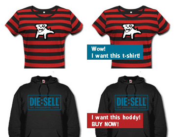
- 80's t-shirt and other great stuff to be a cool ki...


0 Comments:
Post a Comment
Links to this post:
Create a Link
<< Home