The website is down
posted by beining at 14:54
0 comments
links to this post
![]()
/// ads & spam ///
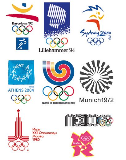 Swedish mag Cap&Design had an article about the different designs of the Olympics:
posted by beining at 11:07
0 comments
links to this post
![]()
posted by beining at 09:09
0 comments
links to this post
![]()
 Piet Mondrian shoes by Vans. Of course found in Japan. Why do they get all the cool stuff!?
Labels: design
posted by beining at 09:08
0 comments
links to this post
![]()
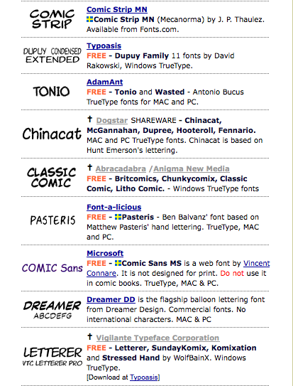 You want to use Roy Lichtensteins comic font that he used in his speech bubbles? One was created by Albright-Knox Art Gallery: "P22 Pop Art Comic"
posted by beining at 17:12
1 comments
links to this post
![]()
posted by beining at 00:02
1 comments
links to this post
![]()
 PC World has done a great job comparing different video sites, such as Youtube, Vimeo, etc. Funnily enough all sites are considered "good"
posted by beining at 11:17
0 comments
links to this post
![]()

posted by beining at 00:36
0 comments
links to this post
![]()
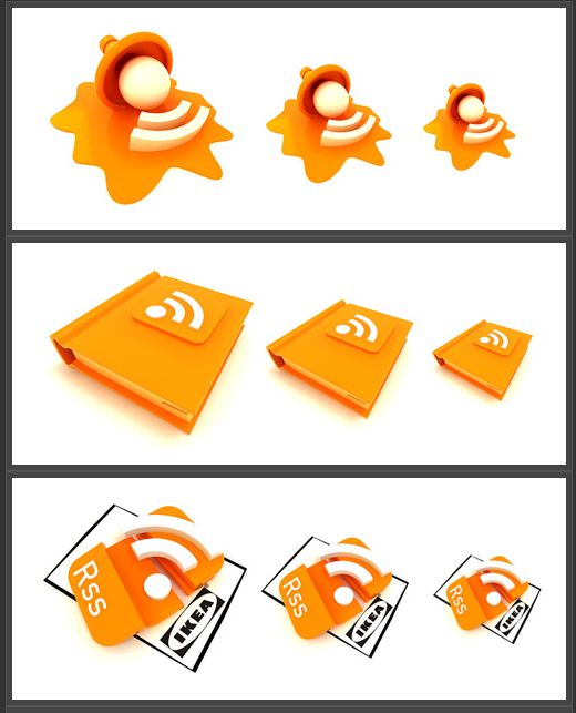 This Russian website has collected an amazing collection of RSS feed icons. Just look at the funny Ikea version!
posted by beining at 23:02
0 comments
links to this post
![]()


