Rene Magritte on my Mac
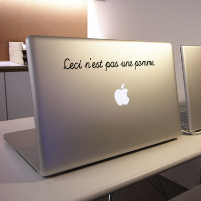
I really love Rene Magritte, so what could then be better than to place him on my MacBook Pro? Etsy.com has some great dekals for $13. But which is best? 
// ads & spam //
I really love Rene Magritte, so what could then be better than to place him on my MacBook Pro? Etsy.com has some great dekals for $13. But which is best?
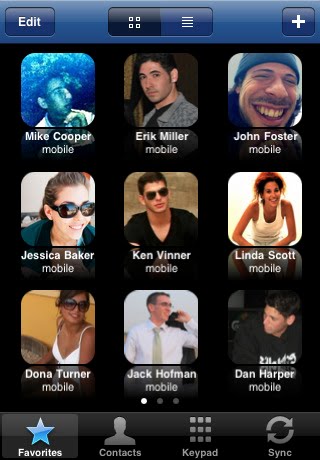
![]() The iPhone’s interface is in many ways amazingly simple and intuitive, but it would be good to customise it. In lack of this option, I hope Apple reads my post and make my suggested improvements.
The iPhone’s interface is in many ways amazingly simple and intuitive, but it would be good to customise it. In lack of this option, I hope Apple reads my post and make my suggested improvements.
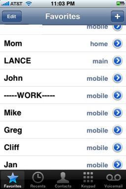
However making the icons the same size as the rest of the iPhone’s icons would give a total of 16 favorites (considering I have several hundred contacts, 16 is not that many..:)
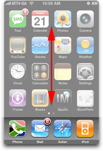 2. Many applications installed gives loads of scrolling
If you are like me, then you have many apps installed. This means right scrolling and scrolling the screen to the right. Vertical scrolling has though not been used:
Small circles could indicate where one is: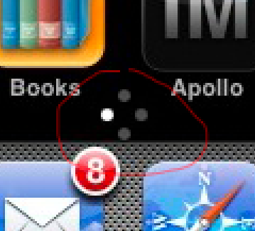
3. Most of my contacts have birthdays noted in the phonebook.
Why isn’t this info linked up to the calendar? Or at least one ought to have the option to get notifications of birthdays. (I use fbCal to have birthdays in another calendar on the iPhone, but I tend to forget to look at it. Hence the desire for birthday intergration.
4. Improve battery life A product can be as fantastic as it wants, but when such a basic feature isn’t in place, then quite alot falls apart. I mean, if I make it through the day with one charing I am happy. Heavy usage makes it last maybe 7-8 hours. Sorry, MAC. Please improve.
Webdesignledger has made as great list of 10 Incredible Sites to Improve Your Typography Skills
Personal favourites include: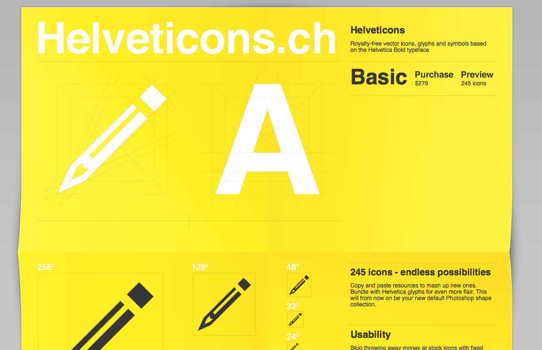 Helveticons.ch
Great websitedesign, great icons. All based on Helvetica Yummy.
Typesites.com
Proper reviews of website typography. Good stuff.
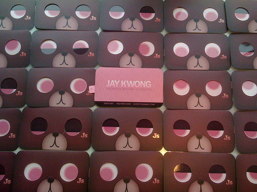
Always fun to get inspired by seeing new and inventive business cards. Hongkiat.com (great site btw!) has done a great job gathering over 100: Business Card Design: 100+ Creative Examples, Useful Tutorials and Templates
Creative Review has yet again analyzed logos for 2009 and these are the logo trends for 2009. To be honest, I find that they have so many “trends”, 13 in total, that it hardly can be seen as a “trend”. Also, some look very similar to last years trends, such as VariDot: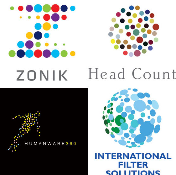
But its still an interresting read.
Laptopstand like iCurve (or Elevator as it is now called) are great. But you might wanna go cheaper. Like MacGuyer you can use paper and cardboard: http://www.cardboardlaptopstand.co.uk/
But why pay, when you can create it yourself!? Laptop cardboard tutorial

Or even from a clothhanger.
 Need a button for your website? A breadcrumb menu? Out of inspiration? Look at http://patterntap.com/ The site gathers sreenshots from several sites and makes it fast and easy to get inspired (or copy..;) Here is an example for “Audio”.
In 2007 I designed the logo (but not the website or application) for the Norwegian startup company Kikora. The company makes software for math teaching to pupils and students. The logo I created was using the idea that the solution for good math teaching is “equal to” Kikora, hence: =kikora. The colors chosen where supposed to show that they were a serious company. I also made a color scheme that had more vivid colors too, but it was turned down. (See the whole designmanual here.) This is my design: 1. ![]()
Two years later they got it redesigned by Miksmaster. They have done wonders with the website and the application as Kikora didnt use any designer on it before. BUT, and I know I am biased here, how did this redesign make the logo better?!
2. ![]()
Not that much, but a bit. Then again, a star is a star I assume… ![]() (not really ready to comment on the new logo. Not decided what I think of it yet. What do you think?
(not really ready to comment on the new logo. Not decided what I think of it yet. What do you think?