Best and worst of Olympic design
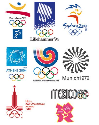 Swedish mag Cap&Design; had an article about the different designs of the Olympics:
Personally I prefer the Mexico from 1988. Pretty funky
And when it comes to the logo for London 2012, I find it looks like the Jewish museum Berlin which was designed by Liebeskind. Great museum and building. But as a logo…!?
No Comments on "Best and worst of Olympic design"
You must be logged in to post a comment.