Moderno vs Modena, logo similarities
 Over a year ago I designed the logo for the architect firm, Moderno. Handdrawn font in black, white and red.
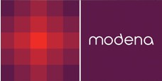
Then, the other day, I discovered a company called http://www.modena.no/ Really similar name to Moderno. BUT even the logo looks VERY similar to the one I designed.
Judge for yourself (I guess, just great minds think alike! 
No Comments on "Moderno vs Modena, logo similarities"
You must be logged in to post a comment.